Rochester City
Site Redesign
Rochester City
Site Redesign
Rochester City
Site Redesign
Creating a simpler and more streamlined user experience in a content-dense website.
Creating a simpler and more streamlined user experience in a content-dense website.
Creating a simpler and more streamlined user experience in a content-dense website.
ROLE
ROLE
Research, UI/UX (Individual Project)
Research, UI/UX (Individual Project)
TIMELINE
TIMELINE
Sep - Nov 23
Sep - Nov 23
SKILLS
SKILLS
User Research, UX Design, Prototyping
User Research, UX Design, Prototyping
TOOLS
TOOLS
Figma
Figma
Project Overview
Project Overview
The city of Rochester's municipal website is outdated and poorly structured. I was tasked with redesigning one use case on Rochester's municipal website. Some things I wanted to keep in mind:
Rochester's personality — make sure it shines through
current site is very layered and goes very deep
features services for residents, businesses, vendors, and more
needs a well-organized system so nothing falls through the cracks
THE EMERGING PROBLEM
THE EMERGING PROBLEM
There’s a wide variety of useful information, services, and features on the Rochester city website, but a lot of it gets lost in the shuffle.
There’s a wide variety of useful information, services, and features on the Rochester city website, but a lot of it gets lost in the shuffle.
01. Research
01. Research
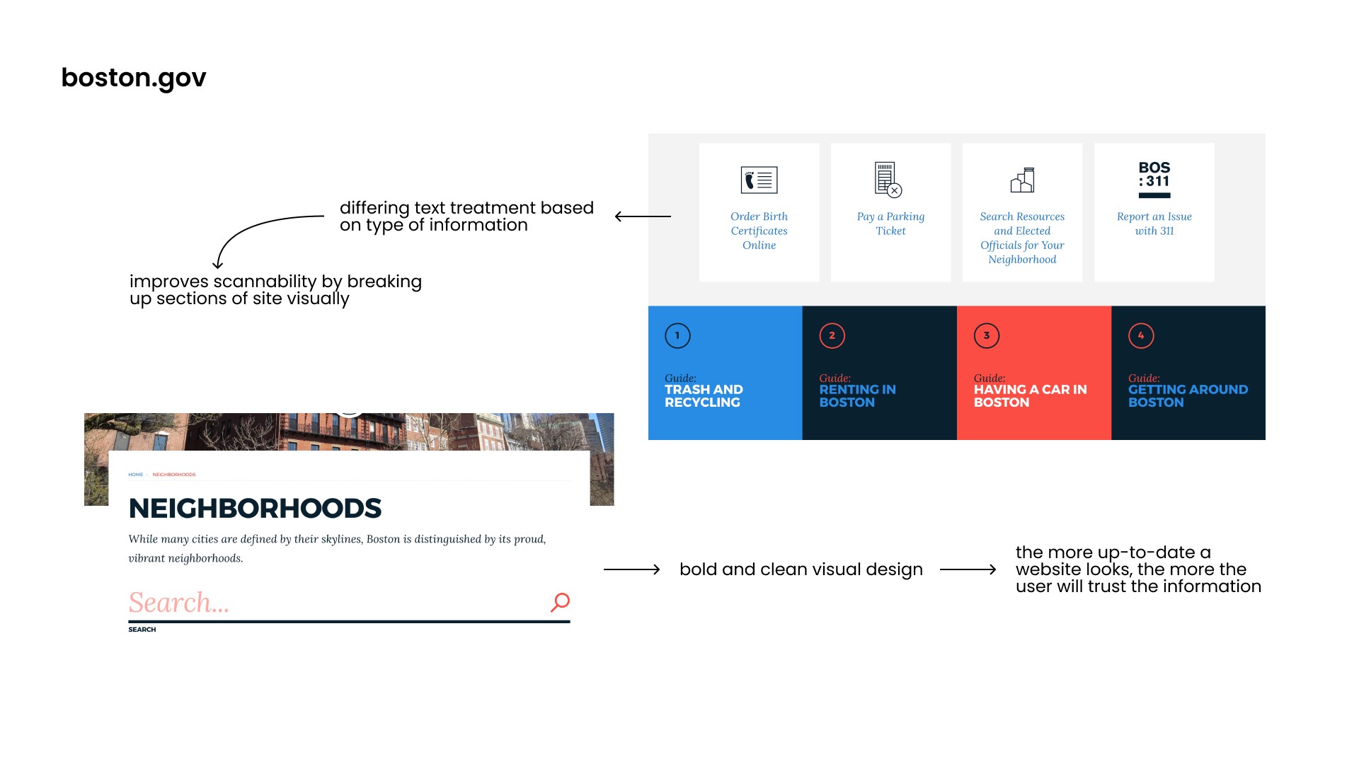
THE CURRENT WEBSITE
THE CURRENT WEBSITE


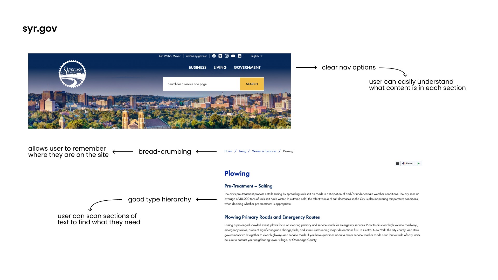
COMPARATIVE ANALYSIS
COMPARATIVE ANALYSIS

02. User Interviews
02. User Interviews
WHAT ARE USERS SAYING?
WHAT ARE USERS SAYING?
I conducted two user interviews. For each, I asked the interviewee to find the Snow Plowing and Salting page and the Plowtrax feature. The flow on the current website for that task was as follows:
I conducted two user interviews. For each, I asked the interviewee to find the Snow Plowing and Salting page and the Plowtrax feature. The flow on the current website for that task was as follows:
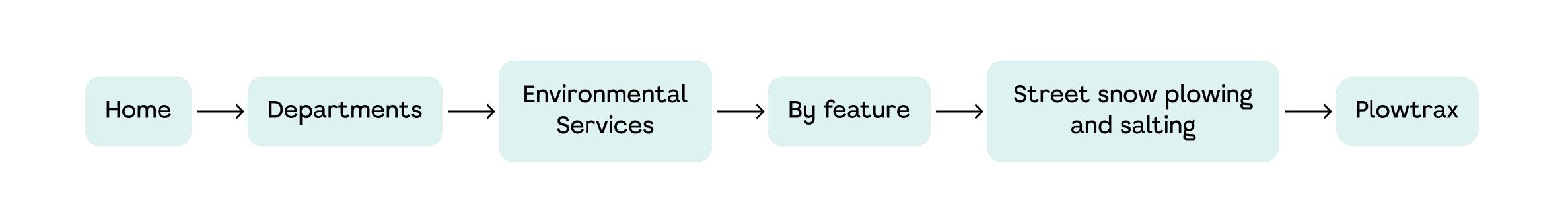
USER FLOW
USER FLOW
first interviewee found the page after much back and forth
second interviewee could not find the page until I gave her a hint
first interviewee found the page after much back and forth
second interviewee could not find the page until I gave her a hint
first interviewee found the page after much back and forth
second interviewee could not find the page until I gave her a hint
PAGE INFORMATION
PAGE INFORMATION
both interviewees felt that the information on the page was sufficient
both expressed a desire for improvements in scannability
both interviewees felt that the information on the page was sufficient
both expressed a desire for improvements in scannability
OVERALL IMPRESSIONS
OVERALL IMPRESSIONS
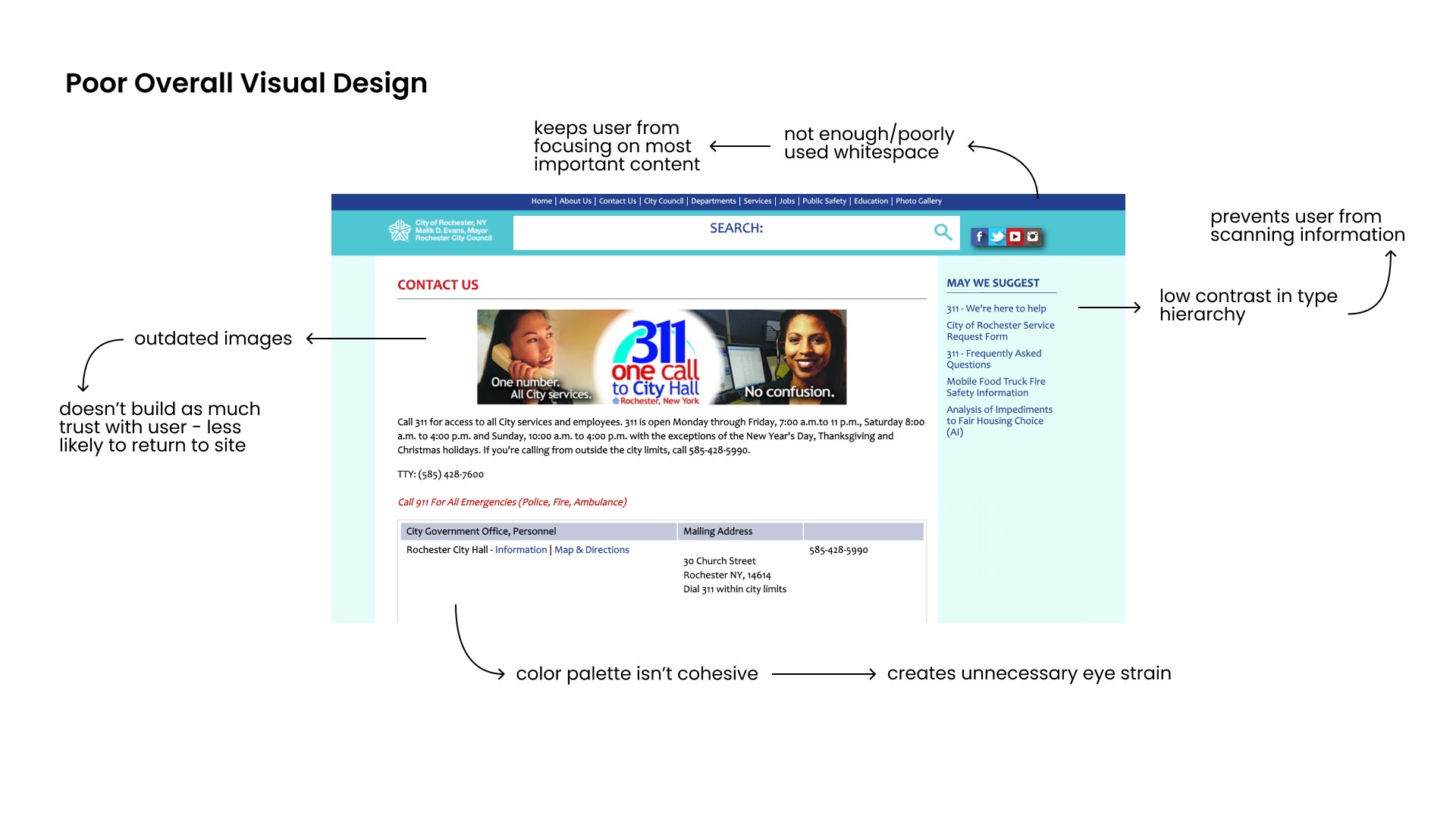
visual design felt outdated
navbar left them overwhelmed
lists of links were confusing, wanted to see that info organized differently
visual design felt outdated
navbar left them overwhelmed
lists of links were confusing, wanted to see that info organized differently
visual design felt outdated
navbar left them overwhelmed
lists of links were confusing, wanted to see that info organized differently
PROPOSED USER FLOW
PROPOSED USER FLOW
Based on my comparative analyses and user interviews, here's how I would reorganize the user flow.
Based on my comparative analyses and user interviews, here's how I would reorganize the user flow.

03. Ideation
03. Ideation
DESIGN GOALS
DESIGN GOALS
Based on my research, I established three design goals to guide my ideation.
Based on my research, I established three design goals to guide my ideation.
INTUITIVE UI
INTUITIVE UI
simple and clear navigation
consistent bread-crumbing
simple and clear navigation
consistent bread-crumbing
REORGANIZATION
REORGANIZATION
different treatment of content
removing duplicate info
different treatment of content
removing duplicate info
BETTER USE OF WHITESPACE
BETTER USE OF WHITESPACE
strategic use of whitespace
allows user to focus on complex information
strategic use of whitespace
allows user to focus on complex information
SKETCHES
SKETCHES
In the sketching stage of my design process, I explored a lot of different treatments for specific types of information and some basic wireframes for the home page.
In the sketching stage of my design process, I explored a lot of different treatments for specific types of information and some basic wireframes for the home page.
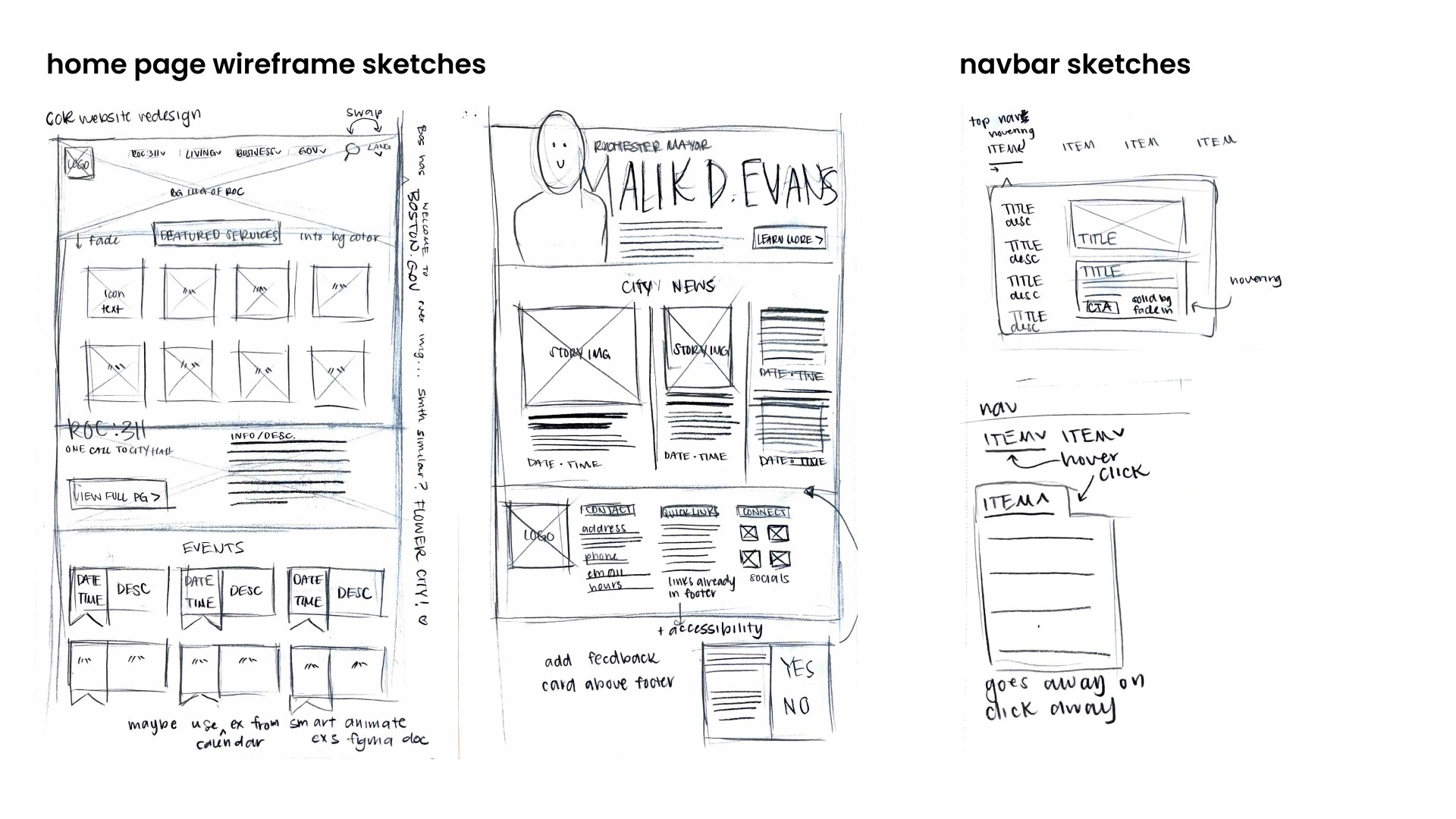

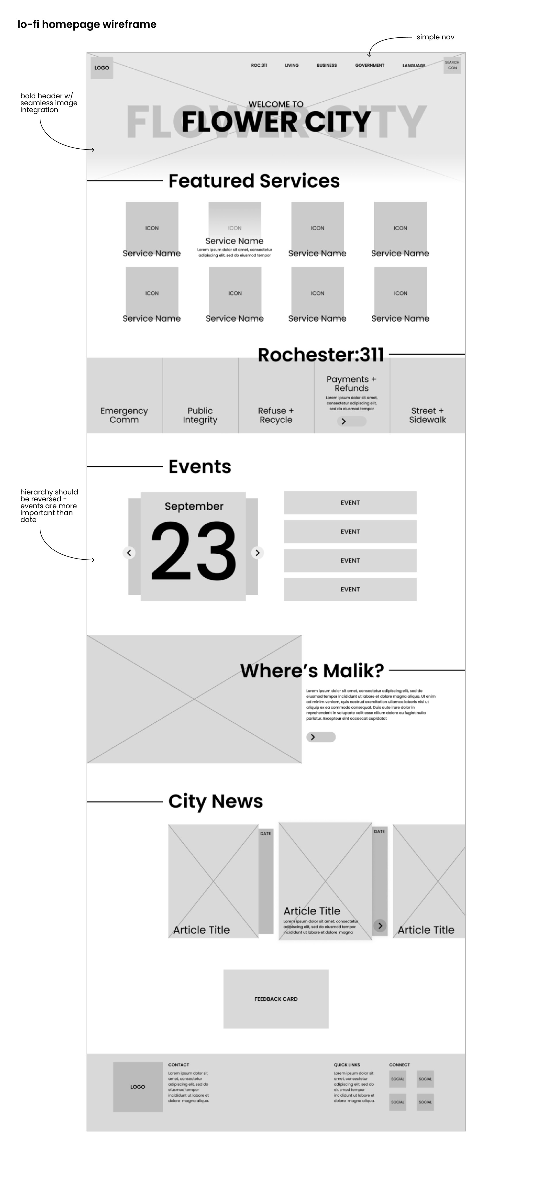
INITIAL WIREFRAMING
INITIAL WIREFRAMING
Taking my ideas into Figma, I started to cut back a bit on the complexity of some of the information, keeping in mind my goal of a minimal visual style.
Taking my ideas into Figma, I started to cut back a bit on the complexity of some of the information, keeping in mind my goal of a minimal visual style.


DEVELOPING THE VISUAL STYLE
DEVELOPING THE VISUAL STYLE
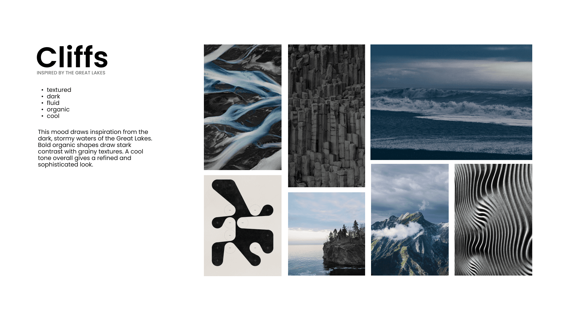
At this point in the project, we created two moodboards to help guide the development of our visual styles. We then applied those moodboards to two above-the-fold designs.
At this point in the project, we created two moodboards to help guide the development of our visual styles. We then applied those moodboards to two above-the-fold designs.


AN ALTERNATIVE VISUAL ROUTE
AN ALTERNATIVE VISUAL ROUTE
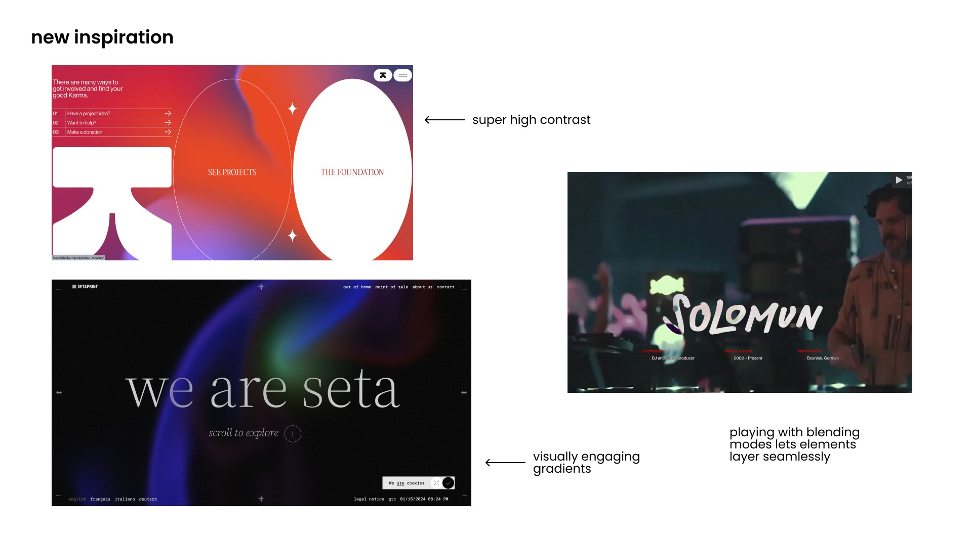
After my initial experimentation, I felt that I had become stuck on recreating the exact vibe of my moodboards and lost sight of my design goals, especially the minimal visual style. I took a step back and returned to finding inspiration. I was repeatedly drawn towards gradients and subtle patterns, so I began iterating with those visual elements in mind.
After my initial experimentation, I felt that I had become stuck on recreating the exact vibe of my moodboards and lost sight of my design goals, especially the minimal visual style. I took a step back and returned to finding inspiration. I was repeatedly drawn towards gradients and subtle patterns, so I began iterating with those visual elements in mind.

04. Execution
04. Execution
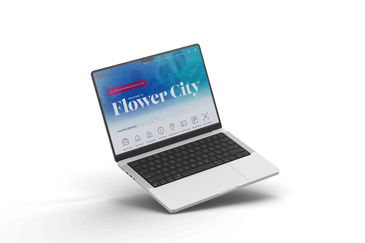
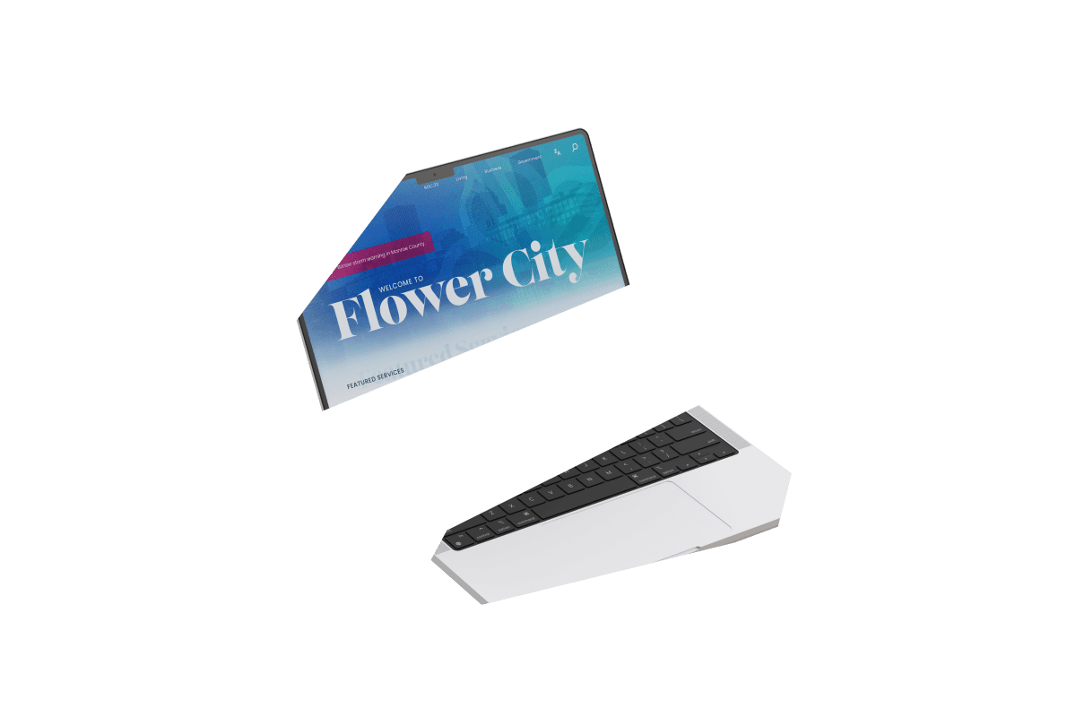
HERE'S HOW IT LOOKS!
HERE'S HOW IT LOOKS!

Final rendering of home page design
Final rendering of home page design
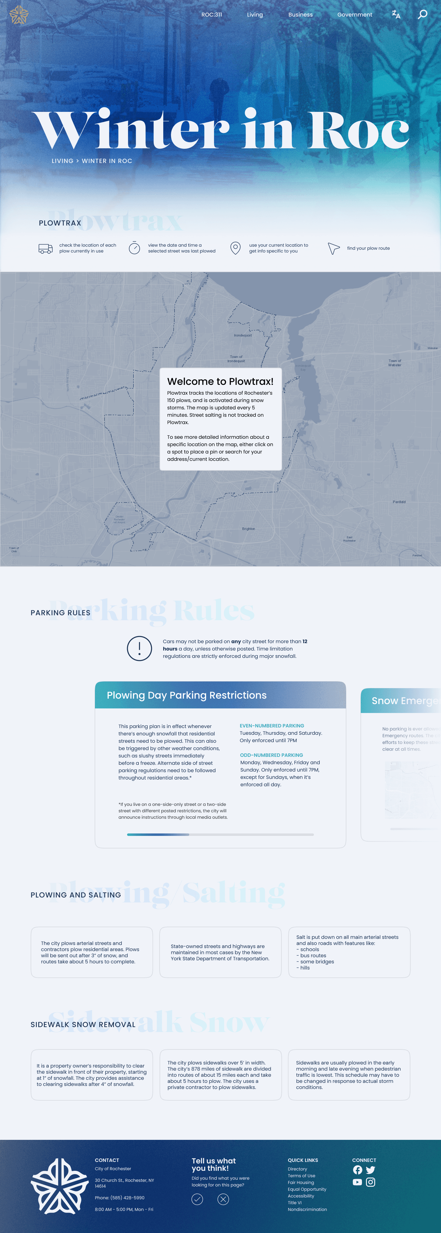
Final rendering of secondary "Winter in Roc" page, with Plowtrax embedded
Final rendering of secondary "Winter in Roc" page, with Plowtrax embedded
Winter storm warning expands to show more information.
Repeated thematic gradient is shown on hover of featured services.
Text in ROC:311 card moves up to make room for a description and CTA.
Arrow expands on "Where's Malik" section to prompt user to visit full page.
News card expands on hover and text moves up to make room for a description.
Video demo of how Plowtrax feature works
Video demo of how Plowtrax feature works
TAKEAWAYS
TAKEAWAYS
Creating moodboards from scratch after spending time on wireframes left me with initial visual designs that missed the mark. This showed me how intertwined structure and visual direction can be, and how they should both be considered early on in the design process.
Additionally, it’s so important to never lose sight of your design goals – they’re guiding your process for a reason.
NEXT STEPS
NEXT STEPS
Conducting user testing to get an accurate idea of usability of the new simplified navigation system.
Creating a design system that can be applied to the entire city of Rochester municipal website.
Applying said design system to the entire website.
Conducting user testing to get an accurate idea of usability of the new simplified navigation system.
Creating a design system that can be applied to the entire city of Rochester municipal website.
Applying said design system to the entire website.